
Sketch of a potential typeface design
Why didn’t I convert this sketch into a typeface?
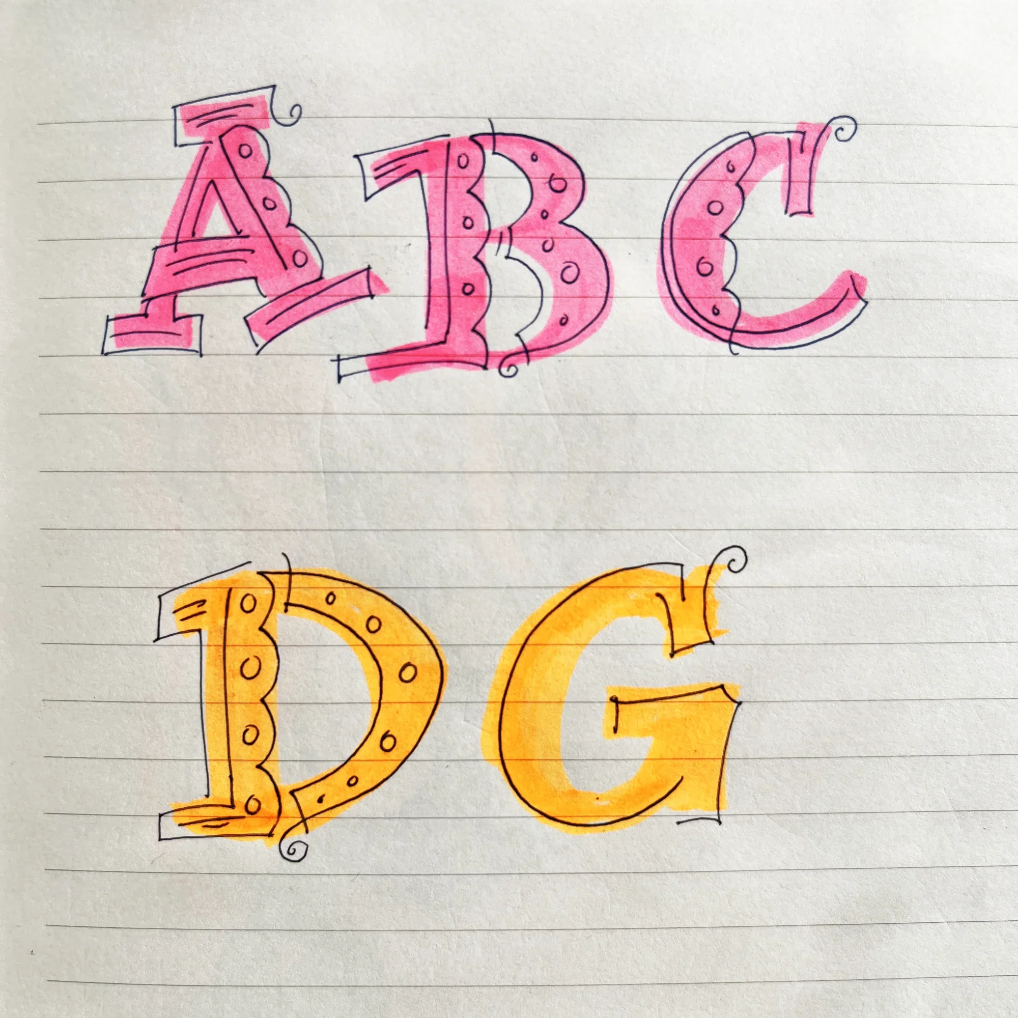
While flipping through an older notebook with sketches and random bits of information I came across these letters. I love them. They were a spontaneous creation. I think I was considering a typeface design when I made them.
I don’t remember the year I created them but I remember how I made them. That’s something. I started with highlighters to draw the letters then outlined them with a fine line pen. The lines have energy because I let my intuition drive their creation. Since they were sketches their proportions were inconsistent but I think I had a solid design direction. I think the scallops and curly flourish are clues.
I didn’t make a typeface from them obviously or I would be sharing it. I hesitated to make a typeface because I believe the letters would lose their energy and, um, character (you’re welcome). I should get over that hurdle.
Tools I used:
Muji Highlighter Markers
Muji Pens
Ruled paper from a random notebook I had laying around.
Sketch that might be a direction for a typeface design